Art quilts are truly a passion of mine and my favorite way to use my quilting skills. An expression of thought and idea in fabric bits, often left over from other projects, art quilts are definitely more expressive and artistic than just the repetitively pieced quilt block patterns (though those have their place in my work process too). Mostly born from a quote and then featuring that quote as a focal point, I see the art quilt as a chance to take a phrase which moves me and bring it to life through my sewing and expressive use of color and stitch work. Here is a the Disciplined Hope art quilt process.
My latest art quilt, Disciplined Hope, was inspired by a quote I saw recently on Instagram – a favorite place to spot inspiration along with Pinterest- by Marisa Renee Lee which reads, “Hope is not light or cheerful. It is a discipline practice.” To me, the quote speaks right to the times in which we are living. You must routinely practice hope despite the terrible news lurking around every corner. From the on-going Corona Pandemic, political division (and often family division because of it), and climate and humanitarian disasters one after the other, there is so much to crush the spirit. Waking up every day, or pausing throughout the day to reflect on and appreciate some of the lighter moments in life or the little joys that still, despite it all, do abound is a routine to practice with discipline lest you be drugged down into the darkness. I could wax on even more philosophically, but I think this suffices to explain why the quote stuck into my brain and seemed to need to come out in art.
Unfortunately, as soon as I had the idea, I had a roadblock to overcome. See, I haven’t been feeling very creative lately. In fact, I would be tempted to say that over the course of the entire summer, I had very little desire to create at all, which is terribly odd for me. Usually I have tons of projects, or thoughts of projects, just waiting for time, but from the very onset of the warm weather, I cared not at all to be in my studio. I pushed through a few creative projects I was on the hook for, finished lesson plans for classes, and filmed Drop-In Art segments, but with little to no joy. So if you were wondering why I hadn’t written on the blog, filmed any YouTube videos, or posted much new material, that is why. No inspiration whatsoever to do any of it. But then I had the Disciplined Hope idea. And then the idea had a deadline. I wanted to enter it into the Perry County Council of the Arts Juried Show, deadline September 20th. Uhoh, time to find a way to overcome the blockage.
Blocks in creativity are precisely why I keep a sketchbook of sorts. I have written about it before. Sketchbooks are a wonderful repository for all of the ideas when they flow and a great place to go hunting when they don’t. And the sketchbook is exactly where I found the composition to match Disciplined Hope.
Sometimes I date the ideas in the sketchbook so I can marvel at just how long I let them ruminate, but sometimes I forget. If they come from a particular source, I try to note it. I like to give credit to the inspiration, as I would want it too. Disciplined Hope’s composition was inspired by Audrey Yeager and a 2016 YouTube video of one of her scrapbook pages “Everyday Has a Story.” What strikes me as so interesting and inspiring about Audrey’s work is her use of innovative color combinations and composition. I pick up so many ideas from her, and have several other sketch ideas based from her work. I love to scrapbook for my own personal, not shared with the outside world hobby. I find that it lends itself really well to quilting being that both use basically 2D configurations of solid and patterned geometric shapes confined to a rectangle or square canvas. For Disciplined Hope, I used my sketch grabbing the main points of Audrey’s “Everyday has a Story” composition, including the color palette, circular elements, and line of latitude. Replacing a photo, the main feature of my composition would be a piece of handprinted cyanotype fabric I received from a friend featuring hydrangea blooms on a deep blue background. I really loved the way you could still see where the fabric had been painted with the cyanotype chemicals, so I planned to keep as much of that as possible in my composition.
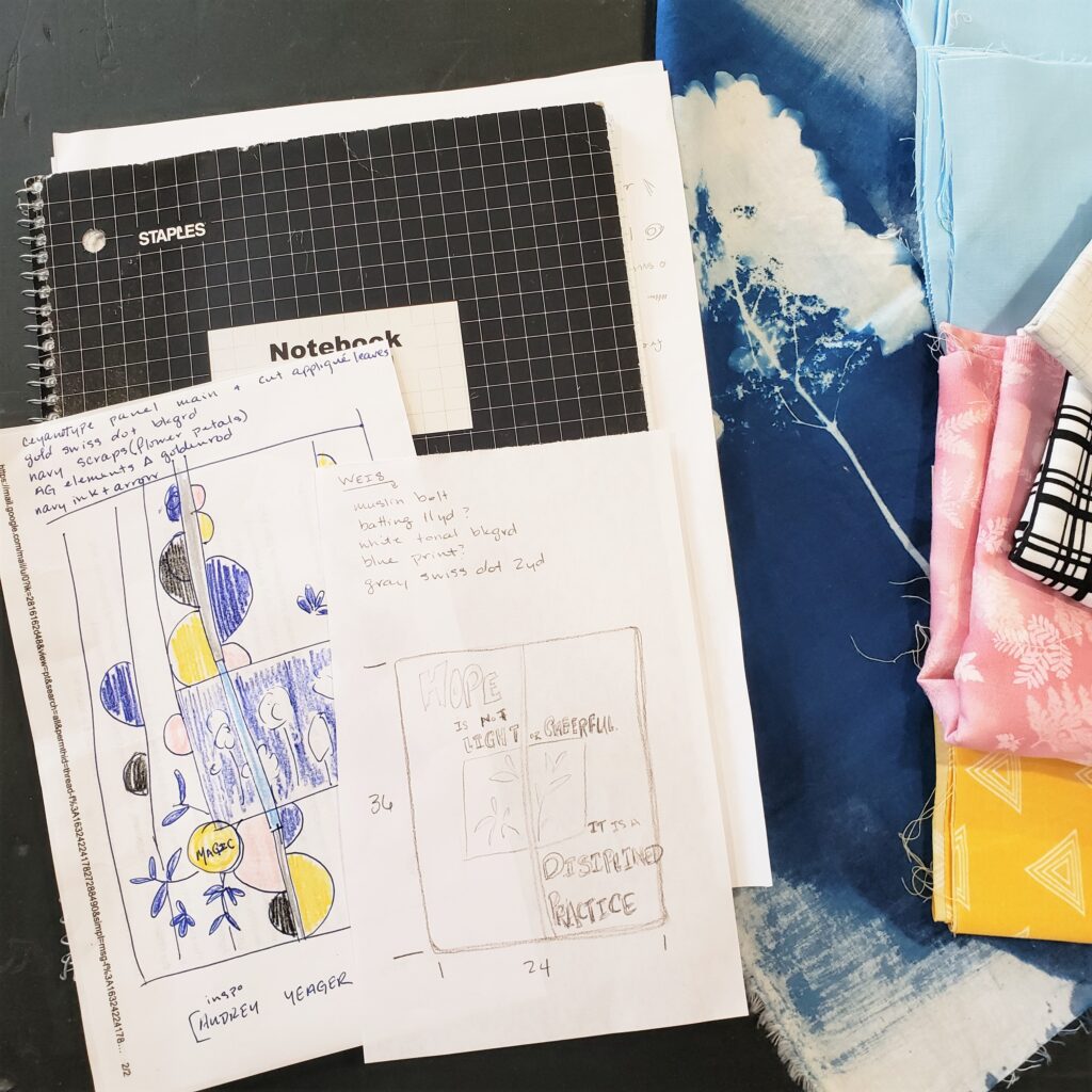
I decided to use the rest of the “Everyday has a Story” color palette for the feature elements of my quote and divide the quote across the bold black line of latitude for greater impact. I reduced the circular elements to keep the overall composition clean and not too cluttered since I wanted to add all of the hand cut lettering for the quote and really have that shine.

As the intent was to make Disciplined Hope for an entry, I had to be sure to keep it within the dimensions allowed for the show. To aid me in the design process, I taped off the size requirements on my design floor. In a total stroke of kismet, the piece of cyanotype focal fabric fit perfectly into the space. Now, all I had to do was decide on a complementary background and complete the rest of the background elements. I chose a cool gray tonal crosshatch for the backing fabric. I felt the crosshatch gave just enough interest, but did not compete with the more prominent elements such as the floral print or lettering. It also reminded me of some of the mixed media textures Audrey often uses in her work. The circular elements in light blue were from a previous project which I was very happy to use again. I don’t often use curves in my work, so it was fun to try to remember how to set them into the background fabric and keep them flat. Perhaps in a future post or video I will go into super detail on setting in curves, but here today I will lightly gloss over my process. (There are also loads of great quilters who have lessons on this, I recommend: Rachel Hauser of Stitched in Color and her Curves Class, and Suzy Quilts How to Sew Curves.)
Basically, I worked with the curved pieces I had before and laid them on the background fabric to determine what to cut away. Then I folded both pieces in half and pressed to find the middle so I could match them up when I flipped the curves right sides together. This bit where they are going the opposite way really messes with the mind – or at least mine- and I definitely need that reference point. I add a pin there and work out from the center sewing down either side of the curve toward the edge. It is necessary to go slow-ish and manipulate the fabric through the turn as you sew. Press – hopefully- flat. Creating the background is naturally the first step and is imperative when adding a lot of other layers onto the top of the quilt. If you need to trim and adjust the background, it is obviously best to do that before you decide and start laying out all of the lettering or other appliqué elements.


I really enjoy meticulously drawing and hand cutting letters. Not really sure why, but it is pleasurable for me. Perhaps it harkens back to my bubble letter writing phase of my 1990s childhood or something, or perhaps it’s just the challenge of getting them all to scale and work correctly whilst drawing backwards. I use Heat ‘n Bond as the backing layer which effectively turns the letters into stickers I heat set onto the background. I would highly recommend using Heat ‘n Bond or similar as it completely adheres the letters and eliminates the use of pins when topstitching which immensely slows the process. I also use a ruler to help space the margins of the letters. The little letters were made with the help of a stencil and tiny embroidery scissors for cutting them out. After adhering the letters I top stitched them in place with a coordinating thread.

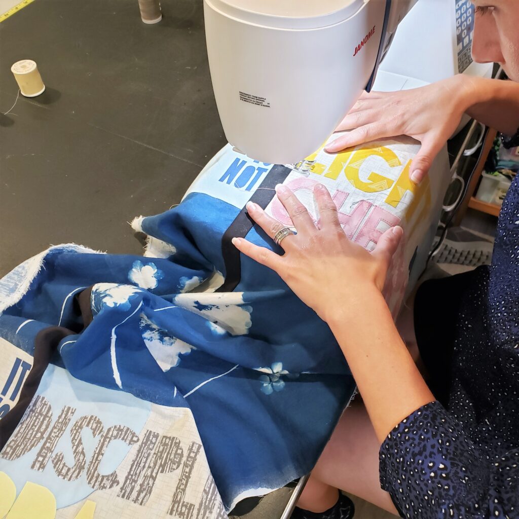
On to the quilt sandwich and the final quilting of it all! To accent the bold black latitude line, I made thin black lines of stitching emphasizing the shape. Again, to emphasize the shape of the hydrangea print, I quilted that area with a deep blue thread in an echo quilting style that looped around and through the background following the shape of the flowers. In the main lettering space I went with a light gray thread to match the background fabric in an approximate quarter-inch diagonal to keep the quote nice and legible, as well as capture any of the letter’s loose edges.

Following trimming and squaring up of the quilt, I once again checked the dimensions against my tape outline. They almost always lose an inch or two in all of the trimming, and Disciplined Hope ended up well within the guidelines for size at 21.5 by 34inches. To frame the work, I added binding (and hanging corners) in a soft cool gray. To the one side of the hydrangea panel, there was a fun raw edge where the chemical paint lines and frayed selvedge were so beautiful I couldn’t bear to tuck them under the binding, so I didn’t. I love that there is a piece of the art quilt that is slightly escaping the boundary. Like hope itself is trying to spread a bit unfettered in this crazy world.


Thank you so much for reading about my art quilt process for Disciplined Hope. I hope you found some inspiration, or at the very least, a moment to pause and appreciate the beauty that still abounds in this world, despite and perhaps because of all of the rest of it.
Stay creative friends, Janice
Inspiration and resources are linked where applicable. All written work and photographs are original content and are copyright protected; kindly give due credit by linking back to my website or source website if you use or share.
(©2021, Janice Bailor // laruedefleurs.com)