Inspiration for a quilt may come from many places. You may see a pre-made collection direct from a designer and think “I have got to have that and I know just the project.” But often, I suspect fabrics are just collected over time and collect in what us quilters call our stash. There may or may never have been a distinct purpose for the fabric, but it was too beautiful or too cheap to pass up, so it is added to the ever growing collection. Personally, I can always find a few new fabrics I have to have, but I also try to be diligent about using from what I already have and mixing the old and new together. Not only does this method keep my stash from growing too out of control, but I also feel it makes my quilts more unique. Rather than using a full collection in any one project, I often pull from a large amount of basic geometric, dot and older, possibly out of print fabrics to give my quilts a timeless mix of new and old. In my mind I have a bit of a recipe or mantra of sorts, not unlike the wedding superstition “something old, something new, something borrowed, something blue.” I try to incorporate all of those elements in fabric, however I’d probably replace the “something borrowed” with something bold and the “something blue” with something gray- ha!
When pulling fabrics for a project, I typically start with one feature fabric to set the tone and feel of the bundle. Depending on the style of the fabric, if the pattern is very symmetrical and graphic or loose and hand drawn looking it is easy to have a direction for the rest of the fabrics. Once I have selected that feature fabric I rifle through my other fabrics to find all of the complimentary fabrics to fill out the rest of the bundle, checking for tome and temperament as I go. Hopefully I have selected a feature print with a nice assortment of colors to search for, and hopefully I have a few of the right ones in my stash! To help decide if fabrics go together, besides using some of the cues from the feature fabric itself, I also like to develop a little story behind the fabric bundle. While I am digging through my fabrics for color, I am also asking if they fit with the story I am trying to tell. So I am looking for not only the color element, but also a story element to see if the fabric adds both the right shade and the right part to the story. Does it move the fabric tale along with another color to play with or another icon to add? These are important elements to building the bundle’s story and making a quilt with not only an expressive color pallet, but also a definable theme. Then with each fabric I lay it out next to the others and decide as I go if they look right together and build the story. Some of this is just a gut feeling or personal preference. Choosing what goes together is part of the artistry and there really is not one right answer. However, if you are new to quilting and unsure of how to build your own bundles, I have a few examples to talk about here that will hopefully help. Just know, like any other skill or craft, the more you practice training your eye, the better it will get and they easier it will be for you to see those harmonious combinations.
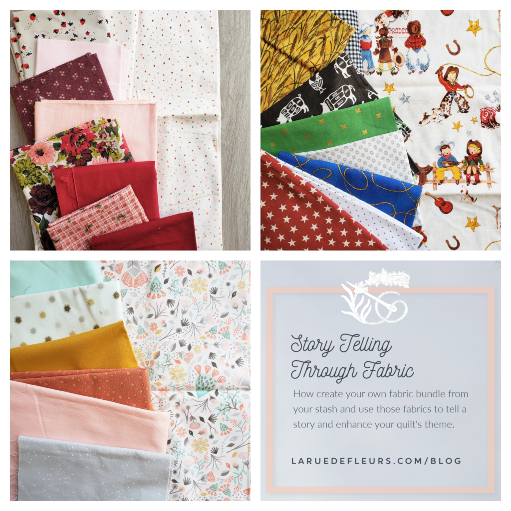
Let’s start with this bundle I am think of as “Weekend at Gran’s House.”

The inspiration and tone of this fabric pull came from the large floral print. A dominant focal point with the bold colors and contrasting red and green pallet, this floral print was gifted to me ages ago and has lived in my stash for a long time. I have tried desperately to use it in the past, but while the color pallet felt really “Christmas” to me, the tone of the print did not. I was never able to use the print with anything- until now! The next print I chose was the hand drawn dot print. Really only the red and pink dots match the colors of the floral, but it also has the hand drawn feel. The dot also has a gold color that compliments and doesn’t compete with the green in the floral and introduces a powdery blue I can work with too. While the floral reminds me of curtains that might be in Gran’s House, the dot makes me think of that ancient speckled linoleum I bet Gran had in her kitchen, furthering the story. Staying in the kitchen -obviously the heart of any granny’s home- the plaid with wonky lines and hand drawn berry motif has all the right colors, right feel and makes me think of Gran’s kitchen wallpaper. Gran really loves wine tones – can’t you tell from her wallpaper and drapes?- and her apron, the burgundy and berry print, is the perfect deep color to compliment the darker flowers of our feature fabric and hide all the berry stains from the pies she makes. So now the story definitely has a berry theme and allows me to introduce the little hand drawn strawberry print, a new purchase from my local quilt shop Humble Stitch, made by Michael Miller Fabrics and part of their new Curiosity line designed by Sandra Clemons. Of course I love the touch of gray the print brings into the bundle, a much needed neutral here, but I also love the scale of the print mixed in with the others. All of the solids provide ample places of the eye to rest among the prints, yet each reinforces the color scheme of Gran’s House, rounding out our fabric bundle.
The next bundle to dissect is a fun one, “Ropin’ With Roy!”

Again, the inspiration fabric for this bundle was a gift and pretty specific. The cowboy print with “Roy” (IDK, it just seems like a cowboy name to me) and all his ranch pals roping, riding and singing through the range set a pretty defined color pallet, tone and story. Bright, primary colors with a strong black and white supporting cast is immediately what I began to search for in my stash. Black and white prints are a great staple item to have on hand in a variety of prints and sizes. Most of these prints here could be used for any quilt, not just this ranch themed one, well, with the exception of the butcher print. Don’t laugh, you need a few odd ball prints in your collection (I actually bought this one to make kitchen accessories for a custom order several years ago), and as you can see here it came in quite handy to add a dark graphic element to the theme. The star burst print, black plus signs and gingham print all worked for me because of the small print I thought would bring contrast to the larger ranch print background. To enhance the roping theme, I was pleased to be able to use some of this rope print in a bright blue. Picking up on the star badges of the ranch print, I was able to find a dark red star which worked with the dark red of some of the shirts, boots and hats in the feature print. The grass green gold x print was a good color match again, and the x print felt like it fit in well as another non-specific graphic print. Of course, Roy’s Ropin’ Ranch has lots of wheat fields surrounding it, and I was pleased to find- and be able to use – this bright yellow wheat fat quarter, another gift fabric. Overall, the color pallet and theme for Ropin’ With Roy came together quickly and I think it would be darling for a little cowboy nursery. White and black with primary pops of color would be a great jumping off point for finishing the rest of the room decor, just add in those bull horns for the most perfect finishing touch!
Lastly, let’s discuss the bundle I’m referring to as “Melody’s Succulent Menagerie.”
Melody is obviously one of the modern day millennials obsessed with her succulent collection. The color palette influences everything in her world, including the way she dresses and decorates the rest of her nod-to-boho home. The succulent print is obviously the jumping off point for the colors and tone of this fabric bundle. This palette is a personal favorite of mine and one I often work in which you might think would have made it really easy to find all the fabrics I was looking for to round out the pull. However, since it is one I frequently work with, I was actually running a bit low on prints I felt worked. Since the succulent print, Blooming Desert in Horizon by Hawthorne Supply, is so busy I wanted to stick with mostly tone on tone or solids so they wouldn’t compete too much with the dominant print. I was happy to find several dots that matched the succulent print and had the same youthful, vintage and whimsical vibe. Then I simply rounded out the fabrics with matching or complimentary Kona Cotton solids. I felt the dots in combination with the solids would stand out well with such a bust background. The color pallet felt as though it would be the dominant palette of Melody’s home; golden and peachy, with touches of grounding gray and sweet mints.
Though you may find some of the story method a bit silly at first, I assure you if you practice it will get easier over time and help lend a clarity to creating your own bundles either from your stash or when you are shopping. Using the questions to refine your choices and help determine whether they fit the story brings the clarity that defines a good fabric bundle. Just as most artists begin designing with these specific people and stories in mind, to truly level up your bundle creativity, you must start to think of yourself as an artist and build your story skills as well.
Do you have additional creative methods that help you build your fabric bundles? I would love to hear them! Leave a comment below with your ideas and share them with the community.
Go forth and create! Janice
Inspiration and resources are linked where applicable. All written work and photographs are original content and are copyright protected; kindly give due credit by linking back to my website or source website if you use or share.
(©2020, Janice Bailor // laruedefleurs.com)