The tag line of La Rue de Fleurs’ is “Handmade, Nature Inspired,” so when the opportunity came up to participate in a local gallery show about being inspired by nature, of course I signed up! The exhibition “Nature’s Palette” is being held January 20th through May 17th, 2020 at the Ned Smith Center for Science and the Arts in Millersburg, Pa. The Perry County Council of the Arts “Art on Tour” Exhibition will feature local artists’ work inspired by the beauty of the central Pennsylvania region, all arranged in rainbow order.
In honor of the rainbow order of the exhibit I’ve been looking back through my work this week at quilts I’ve made and how they have been influenced by the colors of the natural world around me. A mix of custom quilt requests and just projects I was inspired to make, I noticed I sure do hold up to the “inspired by nature” tag line! Here is a review of some of my quilt projects in rainbow order.:

#1 – Red & Orange
Honestly, red and oranges can be tough and overwhelming colors to use in a large quilt. Their saturated nature causes them to compete heavily with other colors and take up a lot of visual weight. And then there is the “bleed factor.” Heavily died colors, especially red, notoriously bleed their die at the most inconvenient of times, like after you’ve finished a 20-hour quilt project. Even with pre-washing, the occasional red fabric will run, and it can be devastating! I always pre-wash reds, or anything similar, but I am still scared it won’t be enough, therefore rarely use it in my work.
However, I do love red, pink, orange and cerise on certain occasions, such as in the Dessert Flowers Appliqué Quilt, where it evokes the dessert rocks of Arches National Park at sunset setting off the strong black silhouettes of the flowers and the floating star splatters.

Red, orange and pink also come in to play when I feel inspired by my summer zinnia garden and all the butterflies attracted to it. These butterfly blocks are a whimsical way to introduce a shot of those bold colors and express the vibrant colors found in the summer garden.

#2 – Yellow
Again, here is a love/hate color. The perfect buttery yellow can be a neutral as far as I am concerned. However, yellow can get rather glaring in the wrong shade or wrong amount. Two of my favorite yellows are Kona Banana, the soft-buttery neutral, and Kona Curry, a bold and saturated shade with a brown undertone. As with any color, the hues of yellow can range from pastel and soft to bold and daring, and there is a place for both in the landscape and the art world. Just as the sun can be soft and glowing or harsh and glaring, so can the hues of yellow in your quilts or other artwork. Having both temperaments to play with makes it an enjoyable color to add into a composition.

A few years ago, I made a large throw quilt featuring a large amount of yellow and little toucans from a former custom order. The Toucan Fiesta Quilt (sold in summer 2019) featured all the bright and bold colors and icons reminiscent of the tropics. Pink, Orange, Red, and especially yellow made for a bright and bold quilt statement. As I mentioned above, my work doesn’t often feature this palette of colors, but just as a tropical vacation can be a welcomed respite from real life, this bold, saturated color palette was a fun interlude to more subdued quilts.

#3 – Green & Mint
In all its hues and shades, from soft dusty mints to glowing chartreuse, green spreads itself unselfishly across the landscape more than any other color. Tree- capped mountains change hues each season. Soft patches of moss and lichen radiate bright green in the sun and provide a deep green in the shade. Beautiful leafy fronds wave their green hues of all shades in the dappled light of the growing season before they fade away to brown. Especially as it relates to the woodland theme, green is a versatile color and often the hue of green can help set the entire tone of a quilt, either light and bright or soft and muted. I do love minty shades for their soft ease of use and ability to soften a color palette. Mint has also been quite popular in nursery décor in recent years as a great gender-neutral decorating alternative to more specific gender colors like pink, blue, red and coral.

In the Frosted Fawn Woodland Minky Blanket the shades of mint blend nicely with gray and silver tones for a soft vibe. In the Adventure Woodland Minky Blanket, the green is a bright Kelly green and therefore dictates the supporting colors be purer and bolder as well. Whichever green you choose, you virtually can’t go wrong as it always brings it’s natural, soothing earth element.

#4 – Blue
The color of the skies and ocean, you can tell a great deal about the day from tones of blue. Either dark and stormy or bright and light, blue hues can greatly impact our lives. In quilts, blue is an ever popular and versatile color. Since many people decorate with blue it can be the perfect base for many types of quilt designs from more traditional to abstract. Especially charming and crisp off-set with white, blue patchwork can really be made to pop with contrast. If your area attempting to create a more subtle, moody feeling, blue is stunning with tones of gray, making patchwork perfect to sooth you to sleep. And of course, blue jeans with all their varying tones and washes make a lovely repurposed piece of patchwork.

Many artists, including myself, naturally find so much inspiration by the watery shores where the ocean or lake horizon meets the sky and blue hues mingle in their true splendor. It’s along the shore you also often see tones of green in vegetation or grays of rocks, all perfect color parings when creating with blue. For the Old Man and the Sea Throw Quilt (sold in summer 2019) I was heavily influenced by the colors found in and around the stormy ocean. Deep navy blue and a dusky tone blended well with gray and moody green tones for the overall effect.

#5 – Purple & Violet
I’d argue purple is one of nature’s least used colors, and one of mine also. Outside of gems, flowers and sunsets, I can’t think of anywhere else it exists in nature’s palette. I suppose it says something that all of the places it does come into play are revered as some of the most beautiful elements upon which to cast your gaze. Unmoved by this revelation, I use purple rather sparingly and most of what exists in my fabric collection is by the request or donation of others. It’s a color you are either drawn to or not so it would seem, at least for me, and I am not drawn to it at all. It seems cool and harsh to me in its violet form and overwhelming in the purest of purples. There are a scant few orchid type shades I find captivating as they seem to have a certain vivacity the blue undertones don’t carry. Kona Gumdrop is a hue of purple, or orchid rather, that I find extremely captivating for a purple. It was the base color for one of my entries in the Nature’s Palette exhibit and along with the bold vine print and black and white it brings a marvelous energy to the table runner.

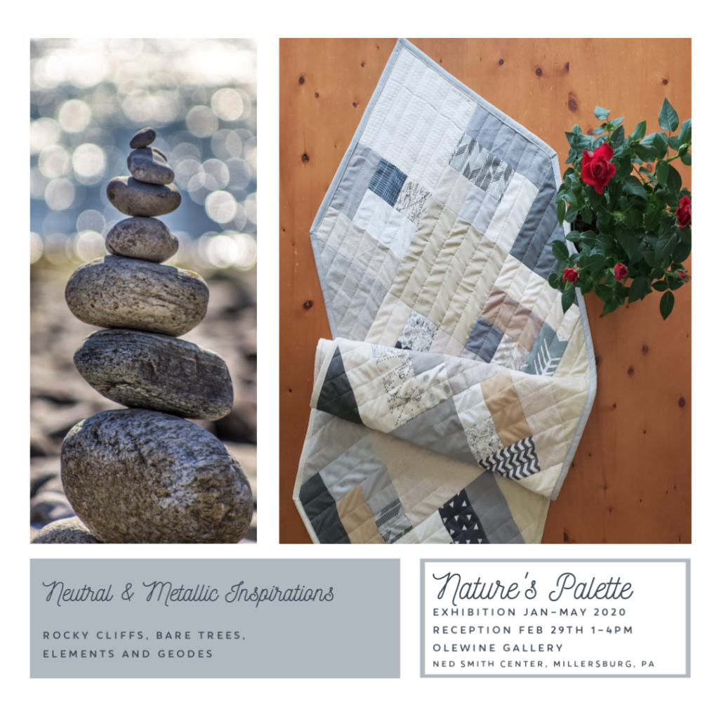
#6 – Neutrals & Metallics
Oh, this one is perhaps too easy. Neutral colors like brown, cream, gray, black and white are everywhere I in nature and fabric. Stark contrast or subtleties of all degrees, neutral colors are the easiest for both humans and mother nature to pull into their work when nothing else, well, works. Tree trunks and earth, the color of brown is grounding. Gray tones of all depths provide a soft background when black and white are too harsh. Metallic colors do the same thing in works of art as they do on the minerals pulled from the earth, of course they bring that dramatic sparkle! Out of all the colors, neutral fabrics is by far my largest collection of materials with three shelves alone being taken up between them. I very rarely make any work that doesn’t contain at least one neutral color (often several) because they are the perfect place for the eye to rest and make all their counterparts shine.

Easy and prudent to decorate with in the home, neutrals and metallic colors are utterly timeless depending on form and design application. Of course, high contrast in quilting can be achieved easily with either end of the spectrum used in your patchwork, or you can go very subtle by choosing neutrals that blend more with the colorful elements. I have even used an all neutral pallet in soft hues for a Woven Trellis Table Runner for my dining table. Thought the pattern somewhat melts into the overall composition, I find it the perfect neutral base for an ever rotating display of flowers, never competing, always complimenting their colors.
Visit the Ned Smith Center for Science and the Arts, Olewine Gallery web page for more information on the Nature’s Palette Exhibit.
Inspiration and resources are linked where applicable. All written work and photographs are original content and are copyright protected; kindly give due credit by linking back to my website or source website if you use or share.
(©2020, Janice Bailor // laruedefleurs.com)
The https://laruedefleurs.com website is one of
the best we have found, and the Inspirations in Color:
Nature’s Palette Exhibition – laruedefleurs.com article is very well written and useful!