Making a patchwork minky blanket is a great beginner project if you’d like to get into quilt making, or are looking for a great gift for a new baby. In this two part series, I will explain how I make my popular patchwork minky blankets including tips on selecting fabrics and finishing with a turned minky edged. Let’s get started in part one with my favorite part- choosing fabrics!
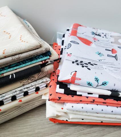
Selecting fabrics is one of my favorite parts of any sewing project. I love staring at my wall cubbies full of fabrics, with all of their possibilities, and dreaming of something new. No project depends more on a considered mix of fabrics than a simple patchwork project such as a patchwork minky blanket. However, you don’t need to have an entire wall of fabrics to pull from to create one of these blankets, you just need to know what to look for to make decisions when you’re choosing fabrics either from your stash or your local fabric shop. Let me walk you through my thoughts as I make my choices for a new patchwork minky blanket so you can see how I choose fabrics, and what you may want to consider when choosing your own.
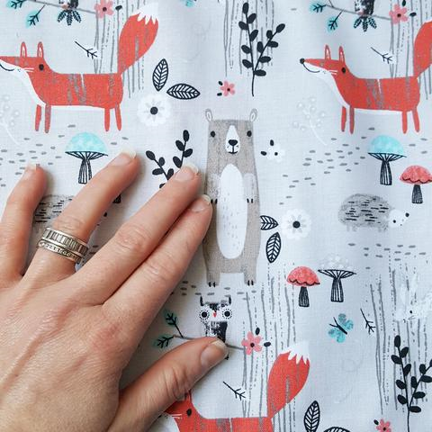
Though a patchwork minky blanket is rather simple in construction- and a perfect beginner project for any aspiring sewist- the fabric selection process is what truly has the ability to elevate this project from basic to beautiful. Each time I pull fabrics, especially in the instance of the patchwork minky blanket, I am thinking of a story or feeling I want to communicate through the fabrics. Color and theme set the tone and tell that tale. I particularly love woodland imagery and a fabric such as this one above with the little bears, foxes, ferns and mushrooms clearly helps establish the story of this quilt as modern woodland.
Now that we’ve chosen a cute feature print, it’s time to consider the other elements of the print which we will use to make the remainder of our fabric selections. Start by noticing the colors within the feature print. For our selection above, the colors of the print are cool gray in light and dark tones, a taupe, a coral and brighter orange, a light aqua and black and white. This will be the color pallet of our blanket. As we look for colors in the shop or in your stash, start by grabbing anything with those colors. I’ll often hold the feature print up against any fabric I think might work and see how well it matches. Obviously, consider the image on the fabric as well. If it’s a robot print with the perfect aqua, I still wouldn’t choose it since we are going with a woodland theme.
Here I was pretty quickly able to pull out several fabrics in the more neutral colors, plus that bright orange. Though we want to get as close as we can on color, you also may not be able to match exactly. That’s where tone comes in. Undertone is the color beneath the color so to speak. Let’s look at our aqua in the feature print for example. Aqua is essentially a blue with an undertone of green. How much green, or green mixed with yellow or blue, can effect the tones. So when we’re matching the colors it’s okay if the value, the lightness or darkness of the color is off, but it should “tone in”, or have the same tonal values as the color we are trying to match. Choosing a variety of tones of each color is a great way to provide depth and layers that build the interest of the otherwise simple patchwork top. If you’re interested in more information on undertones and color value, I recommend this great article by Kate Smith for Sensational Color, Understanding Undertones Equals Color Success.
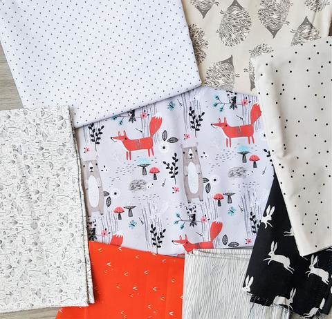
Now I have a nice range of neutrals, but none of the color that makes the blanket have a fun, playful pop I would go for in a design intended for kids. Since I typically like to keep my fabrics for the patchwork minky blanket to between nine and eleven fabrics, I will set aside a few of the neutrals that are less exciting to me or don’t do anything to convey the color story or theme. Here I would remove the scattered black and cream dot (AGF, Firefly) as well as the tiny cross in black and white (Hobby Lobby). Neither really has much punch next to the other fabrics in either color or theme. I will head back to my fabrics and see if I can find more color!

In this round of fabrics I have edited out a few of the neutrals I found less interesting for some more colorful options. I have also swapped out the very intense orange print for a slightly softer coral which I feel is more pleasing to the eye with all of the neutrals I seem to be gravitating toward. While you do want playful pops of color, you don’t want anything to steal the show from the feature print and cause the eye to get suck so-to-speak on that intense color. So, to create more balance the bright orange had to go and we need to add in other more saturated color prints to balance out the new lighter coral triangle print. The aqua diamond is a great compliment here and pulls out that color from our feature print. I also found another secondary feature print aptly named “cozy dream owl” (Cotton and Steel) to help reiterate our theme and colors. I love it when that works out so well!!
Varying the scale of prints also adds to the detail and interest of the patchwork. As we start to refine our fabric selection not only by color, it is also important to look for varying sizes of prints. The black and white tile print is great in color and feel, but it just has too large of a print and it also feels like it’s competing a bit with the rabbit print (Cotton and Steel, Ghost Bunny) with the same colors. Obviously, the rabbit print wins the round because it matches on both color and theme. I also found a black and white dot and a small flower print in orange which are a bit more restful for the eye, while still carrying color and theme. And, of course we have to include the large hedgehog, as he is also perfect on color and theme and introduces a really large print for another layer of interest.

We’re nearly done, honest. The last step in fabric selection is to consider what might still be missing or isn’t connected to the the main fabric, color story or theme. Here I am looking for another dark color element to balance the black bunny so it doesn’t draw too much of the attention as discussed above. I don’t want another black print though, so I find a beautiful blue fern print. It has that deep saturated color, is a great match on theme, but there is an issue, it’s a navy blue color not found in the feature print. It does match with the undertones, as well as connect the navy triangle in the coral print, so it stays. Nearly all of the prints are connected now. The only color that is missing is the taupe present in the feature print on the bear character. Huzzah! I am able to find the perfect match with this dandelion print, and it even has a beautiful metallic sheen for a nice glisten and additional interest!
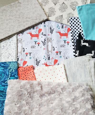
All done! We’ve got eleven fabrics all based off of the feature print. Each fabric adds a connecting piece of our modern woodland theme and color story. Some of the prints are small, some are large, and a few are medium. We have some fabrics with very saturated colors, and some with those more neutral, restful tones. Our eye sees plenty of movement, yet has a few fabrics on which to rest. We have included geometric prints for our modern feeling and all of the woodland prints to carry the theme of little forest friends.
In part two of the Makings of a Patchwork Minky Blanket I will discuss how we go from this awesome fabric selection to finished snugly minky blanket perfect for gifting and cuddling! Now go forth and choose those fabrics with confidence!
Not in the mood to DIY or looking for more inspiration? Browse my full collection of Minky Blankets in the La Rue de Fleurs Etsy shop.
Stay Creative Friends, Janice
Inspiration and resources are linked where applicable. All written work and photographs are original content and are copyright protected; kindly give due credit by linking back to my website if you use or share.
(©2020, Janice Bailor // laruedefleurs.com)
Pingback: How To Build Your Best Fabric Bundle - laruedefleurs.com
Pingback: Quilt and Project Goals for 2022 - laruedefleurs.com
Pingback: Thinking Ahead for Holiday Gifts with the August Trunk Sale – laruedefleurs.com