
Everything is Going Greige
I read an article just this morning about how the world is going from various colors into a beige homogeny. As we as a society move toward the ever-increasing drive to “keep the resale value,” personalization of items from homes to cars to decor have lost a lot of personality. The article “Colour and Shape: Using Computer Vision to Explore the Science Museum Group Collection” from Science Museum Group Digital Lab examined photographs of their collections of objects over roughly 200 years, finding that the color leaned more and more toward gray. The article makes sure to recognize that over time the rise in the color shift may have occurred as products such as electronics have become more popular and are generally made from neutral-colored plastics, rather than wooden objects made in the earlier centuries.
“Very interesting,” you say, “but I am mainly here on your blog to read about home decor and quilts, not science and history.” Well, I feel it is worth noting as well that home decor trends in both interiors and exteriors have gone more toward the mass appeal of neutrals in the last several decades as well. Gone are the days of the 1970s brightly colored and sometimes patterned carpets. When I was a child, we even enjoyed spotting the interesting animal blobs that seemed to be present in our carpet. Children of the 2000s and beyond will never know of this fun game, with their solids only beige or greige carpet. Home types and entire neighborhoods too seem to have largely gone toward mass production and appeal. Gray, beige and white everything!
Battle Back
Please don’t get me wrong, I do love gray. And beige. And sometimes white and off-white. We all know as a background for our quilts (and sometimes, our walls) those colors can be the perfect compliment to make other colors pop. Unfortunately, some people seem to have forgotten to add the pop of color at the end of their neutral decor. I, for one, will never do that! It is also the aim of La Rue de Fleurs to never let you do that! I vow to always add plenty of color pops and personality to every quilt, even if it has a gray background.
Here are a few of my favorite quilts which blend the neutrals – gray, beige, off-white, white, etc. – with bright pops of color so you can bridge the gap from boring to bold. Let’s battle back against greige!
Cool Tone Scrappy Plaid-ish Quilt
Anything but boring and basic, my 2020 Cool Tone Scrappy Plaid-ish Quilt leaned heavily on black, white, and gray. Although so many of the prints used in the quilt were those neutral colors, I think you’d agree, it is anything but neutral.
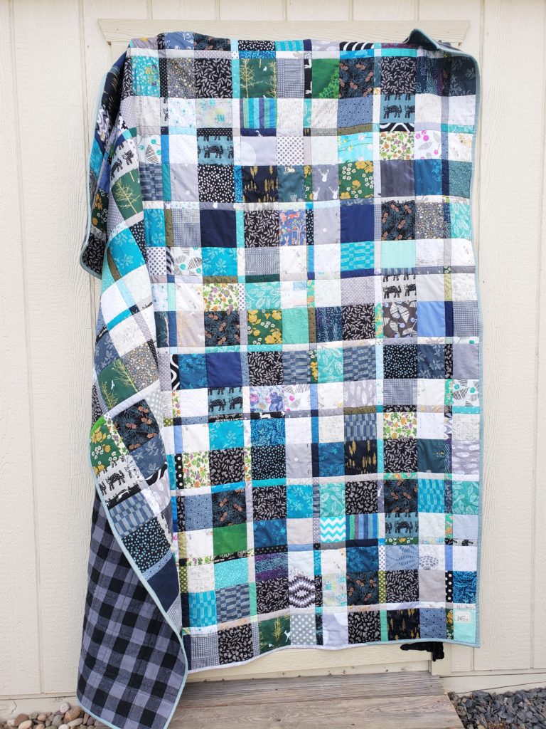
The cool grays, white and black are all mostly patterned to blend in with the other more colorful fabrics. Blue and green tones are the dominant colors in the quilt, and the neutrals here are the supporting cast. I kept everything in the cool colors to keep harmony between the palette and finish the plaid effect. In my opinion, the Cool Tone Scrappy Plaidish Quilt bridges the gap between any basic gray and blues and greens in home decor. I made this quilt for my husband, so I wanted to keep it very masculine, but now it ended up mostly in our living room which is – ghasp!- painted gray.
Field Study Quilt
In 2020, the year of nesting at home, I also completed a new bed quilt for myself. The Field Study Sweet Life Quilt used a large number of neutral background prints in white, cream, taupe, and gray to surround the very large feature prints. And though there are a lot of neutral background colors in this quilt, here it reads more as a texture than anything else. The main colors of the quilt are in the cool spectrum again, since I made it for my bedroom, which is painted a color called “juniper mist,” a deep blue-green.
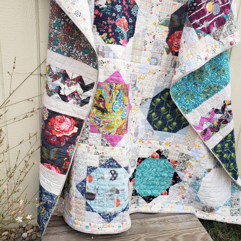
I selected the fabrics in the Field Study Quilt more for the joy they gave me than the color palette. However, they mostly harmonize, which is very important to me in building the fabric pull for a quilt as well.
Shattered Squares Ice, Ice Baby Quilt
Ice, Ice Baby was my test quilt for the Shattered Squares Quilt Pattern I wrote and released in 2020. Ice, Ice Baby has so much gray, from the solid gray triangle pieces in the blocks to the gray and white swiss dot background. Yet, I think you really see the soft periwinkle, deep blues and light lavender colors when viewing the quilt. I love this color palette so much. If you wanted to paint a baby room gray for that neutral wall longevity, add in the blues and lavenders of the quilt to complete the tranquil color palette. That way if they outgrow the non-neutral colors you don’t have to repaint. I guess that’s the beauty of the gray wall….
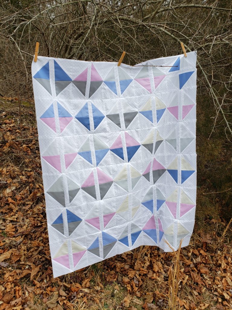
I have a decor inspiration board as a part of the listing for this quilt in my Etsy shop. I see it paired with swallow wallpaper and clouds. The Ice, Ice Baby quilt is available in my Etsy shop.
Desert Flowers Quilt
Desert Flowers Children’s Quilt is truly a great example of a basic beige background being anything but basic! When I look at Desert Flowers all I see are the details. From the retro mod-inspired black flowers to the fantastic vintage trim, the quilt is merely using the beige background as the canvas. Pops of gold and vermillion definitely lift off the background and truly shine against the natural background.
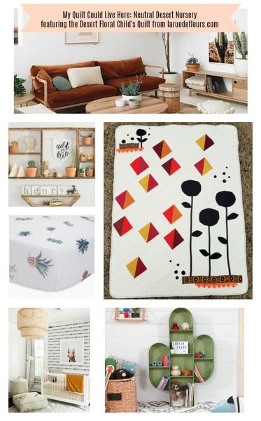
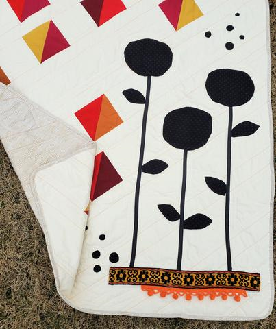
Again, I would use the quilt as a jumping-off point in an otherwise neutral space. You could paint the walls, or use those existing builder basic beige walls as the background for a very chic desert nursery. The soft sand color is a feature of the Desert Flowers Quilt, but the vibe is anything but subtle. Similar to a desert, the deep shadows of the flowers dominate, with the golden light and warm red tones evoking the heat. Paired with a few changeable desert-inspired accents like the adorable succulent sheet set and potted plants, the room goes from basic to pulled together pretty quickly. The Desert Flowers Quilt is available in the Etsy shop here.
In Conclusion
My final thoughts are, keep the neutrals, but make sure you keep the color and personality too. There is a way to blend the basics and retain the personality of a quilt, room, or home. Obviously, I am a huge fan of neutral colors, as these are just a few examples of my work featuring a fun neutral background. The neutral canvas allows it to blend in with the home as it is in all its neutral glory. However, the prints shine and interject the one-of-a-kind nature and personality we should all strive to build in our personal sanctuary. Never forget to make a sparkly treasure you have to have both glitter and glue. Without the glue, the glitter goes all over the place. But without the glitter, the glue is just a glob without a job.
Have an inspired day! Janice
Inspiration and resources are linked where applicable. All written work and photographs are original content and are copyright protected; kindly give due credit by linking back to my website or source website if you use or share.
(©2022, Janice Bailor // laruedefleurs.com)